Your newsletter is the best way to communicate with your audience. You want them to see your email in their inbox and lean into their seat, eager to devour your words. But there is another component to a deliciously engaging newsletter–eye-catching design.
Italian designer Massimo Vignelli said about design, “styles come and go. Good design is a language, not a style.”
What language are you speaking in your newsletter?
What Makes Design So Important?
Humans are visual creatures. We are easily influenced by the appearance of high quality. Most of us have heard the studies of putting cheap wine in an expensive bottle and receiving higher tasting scores.
The same effect will occur with the design of your newsletter and the influence it has on your audience. A well-designed newsletter template will help your newsletter to convey the value it contains.
Needless to say, creating a great-looking newsletter is important. It doesn’t need to be difficult or overwhelming, though. The beehiiv editor allows you to save templates that can be used as a starting point for each newsletter you create. You can also save, review, and reactivate past versions of your posts.
Once you’ve refined your newsletter’s look and layout, you can save that template and ensure you have a beautiful newsletter and consistent layout for every email you send.
Lauren here at beehiiv has written an excellent post on 10 best practices for beautiful and effective email marketing design. If you’d like some more food for thought for your design and templates, be sure to give it a read.
We’ve also prepared a tutorial on using the beehiiv editor to design your newsletter:
Now that we understand the importance of the visual elements of your newsletter, let’s dive into some inspiration for your email newsletter templates using the beehiiv editor to save time and achieve fantastic results.
5 Options For Weekly Email Newsletter Templates
We have collected some examples of skillfully-designed newsletters to get you on track. Here are our favorites, and how you can use their ideas to inspire your own design.
The Neuron
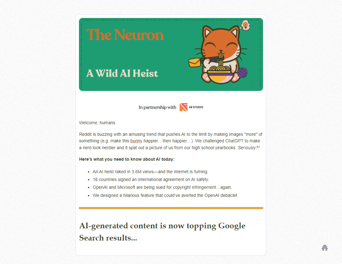
The Neuron is a colorful grab-bag of AI news. They don’t merely curate news on the most historic revolution in over 30 years. They make it fun.
While they consistently follow a series of sections related to news, commentary, humor and quizzes, the color and graphics are largely unpredictable.
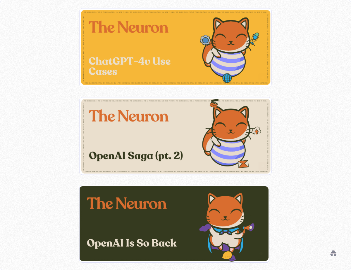
For one thing, every day they use a different background color for their header. Their feline mascot changes in subtle ways. And adding to the madness, even their content break dash is a different hue every time it appears.
Whether you want to read short articles or prefer to scan, The Neuron has you covered.
They always open with “Here’s What You Need to Know About AI Today.” This section reduces the top stories to bullet points. If that’s all you have time for, you’ll still walk away better informed.
Later, another section called “Around the Horn” gives you more bullets but each one includes a link to a longer article.
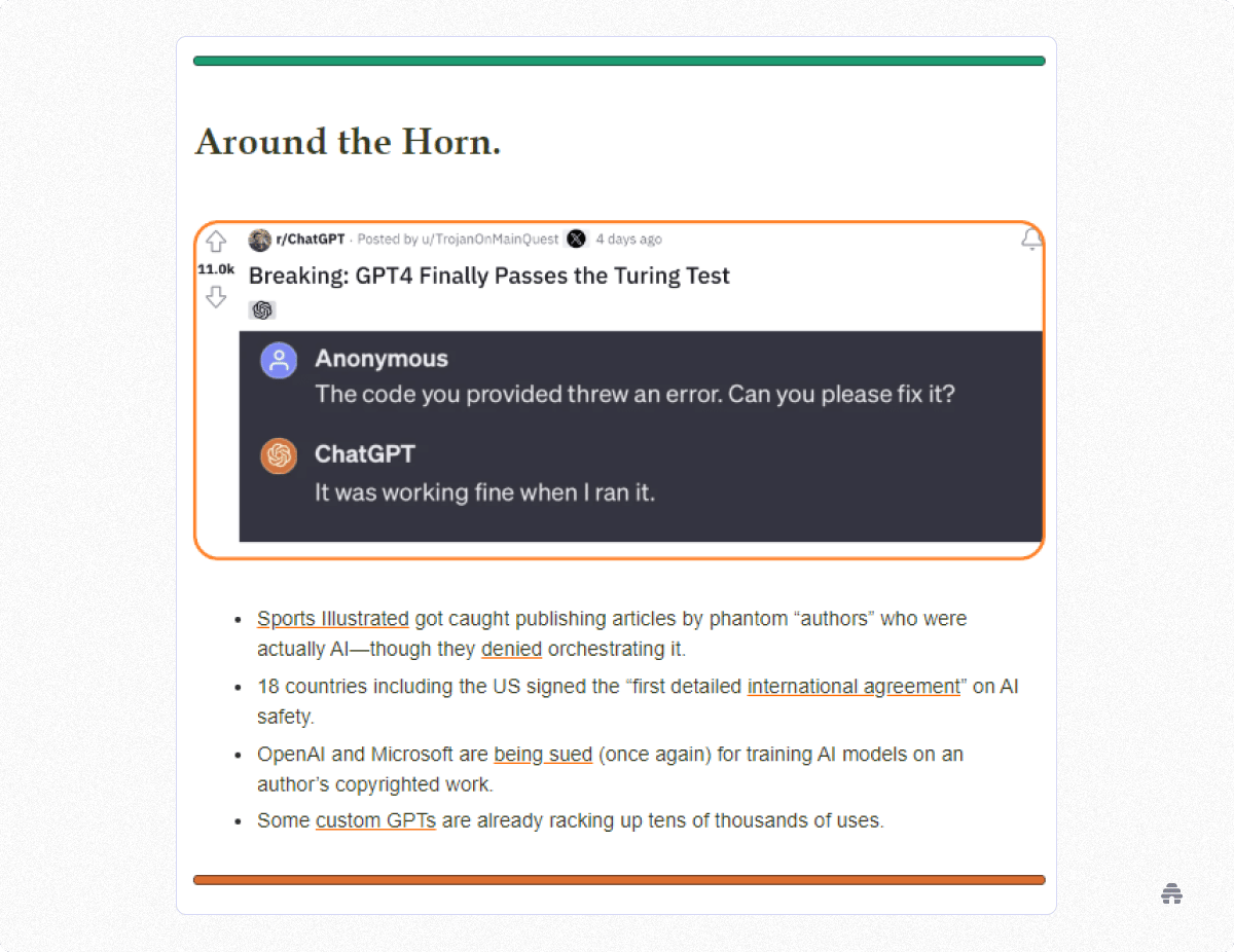
Most sections of The Neuron are illustrated with screenshots from X (Formerly Twitter), which adds to the feeling that they’re saving time by filtering your news for you.
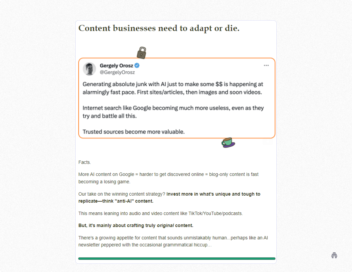
The Neuron is a surprisingly comprehensive newsletter, considering that you can read through it in a matter of minutes and feel like you just did something fun.
Takeaways from The Neuron:
Curate content—This solves the dilemma of offering a quick read without skimping on important information
Play around with color and graphics without compromising your brand
Have a little fun, and your readers will, too
The Milk Road
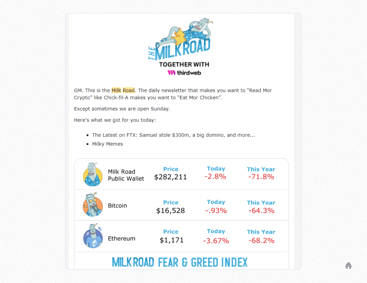
The Milk Road has developed a distinctive brand identity centered around a fun and friendly tone of voice, which is immediately obvious to visitors with their milkman mascot.
They don’t use a lot of flashy designs in their newsletter. Instead, they opt for a tidy, clean look–but it’s extremely effective in conveying the value of the message. Subtle details, like content breaks with images of their mascot reading the paper or lounging, reinforce the brand identity.
To create The Milk Road newsletter’s content breaks, they are using custom-created images instead of the standard content break dash. To ensure no background color mismatch, the images have a transparent background to take on the background of their newsletter. Now if they ever choose to opt for a different color background in their newsletter, they won’t have to recolor all of their custom content breaks.
The Milk Road was able to leverage beehiiv’s intuitive, easy-to-use template editor to create a high-quality newsletter in very little time. Compared to hiring a custom developer team and designers, beehiiv allowed them to be up and running quicker and saved them hundreds of thousands of dollars in the process.
The Milk Road was acquired in less than a year. Tyler Denk, beehiiv CEO, wrote about their acquisition and how they got to this point so quickly in our blog if you’d like to know more.
Takeaways from The Milk Road:
Add your own, unique twist to a common practice (the content break dash)
Include design elements that are easily adaptable (such as a transparent background)
Take advantage of time-saving technology (the beehiiv editor)
Payload
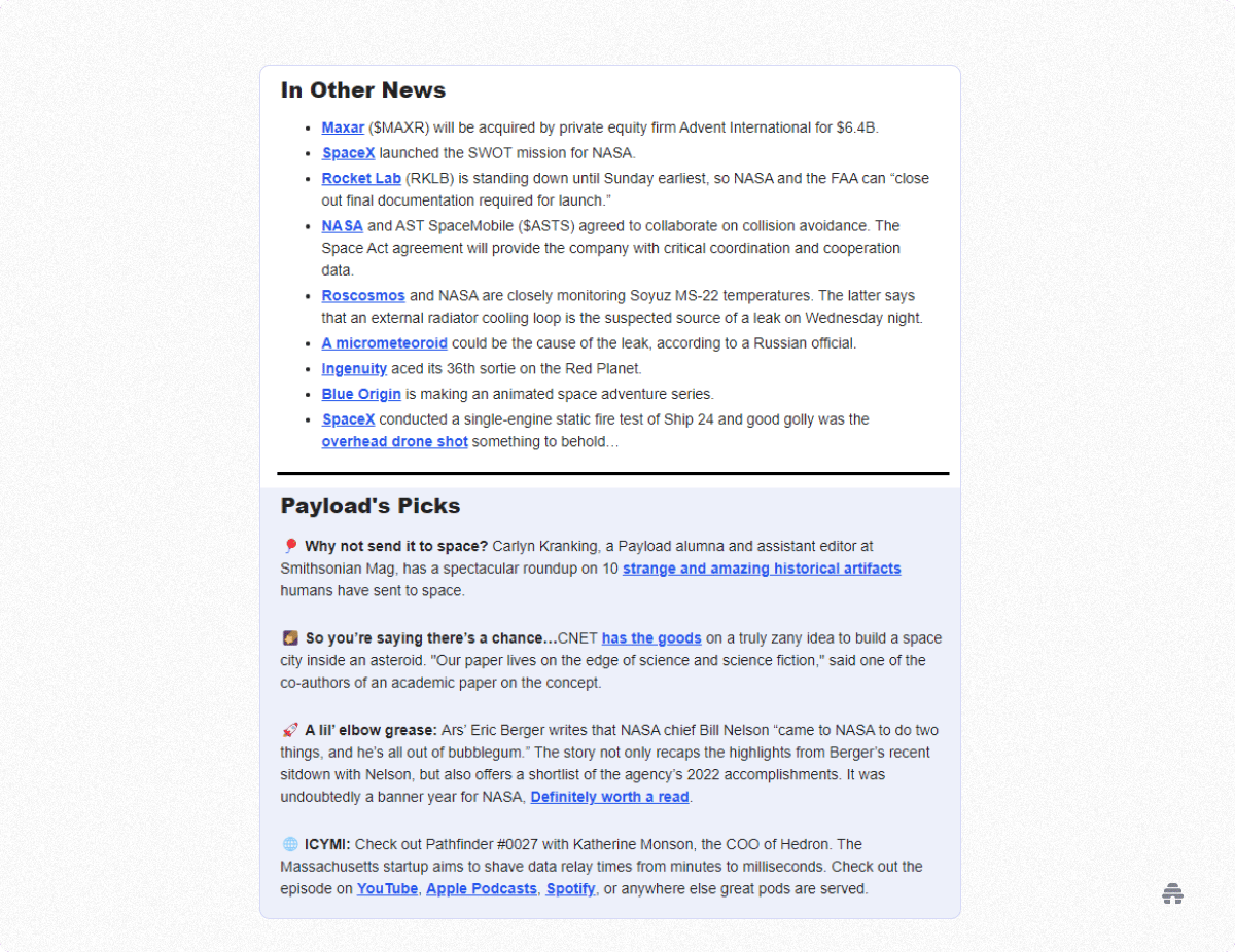
Payload is using the beehiiv platform to craft a beautiful, easy-to-read newsletter covering the business and policy of space.
They achieved this through subtle methods. Payload changes up the visuals of their newsletter as you scroll through it to keep things interesting for the eye.
The newsletter uses emojis throughout, keeping it from feeling text-heavy. As you can see in the screenshot above, they also change up the background color of different sections. The background color changes are as simple as the click of a button in the beehiiv editor, and by creating a custom template with a specific section in a different color, Payload saves time by avoiding the need to recreate the layout for each newsletter they write.
The key takeaway from Payload’s design is that nothing is overdone. The different background color is not distracting. The emojis aren’t excessive, used just enough to lighten the load. They manage to strike a balance of interesting design without being distracting.
We also like how each newsletter ends with “The View From Space,” which literally features an image from space. This makes for an interesting and intriguing end to the newsletter for subscribers. Each week the audience knows they’ll end with an interesting picture which helps to keep the open rates high.
Takeaways from Payload:
Use emojis and other visual elements to break up the text
Don’t overdo the visuals
Include an interesting and intriguing end to the newsletter so readers are eager to open and read it
The B-Side
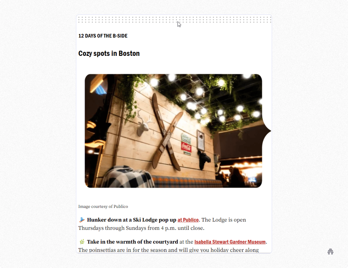
The B-Side is a weekday newsletter covering local news around Boston. The newsletter is published through beehiiv and owned and operated by The Boston Globe.
In keeping with the strong reputation of The Boston Globe, the newsletter contains engaging Boston-focused content in an eye-catching format.
Just like The Milk Road and Payload, The B-Side says “less is more” with a simple, clean design. The B-Side uses custom-cropped images with high-resolution photos or attention-grabbing colors to cleanse the visual palette between chunks of text–just enough variety to keep things interesting.
They also use topical emojis to help break up text-heavy sections. Rather than changing the background color like Payload, The B-Side changes the text color to highlight specific sections and help pull the readers’ eyes along the page.
Each topic in the newsletter is broken up into easily digestible sections that help to keep readers engaged without being overwhelmed. The B-Side has also leveraged the easy-to-use template editor on the beehiiv platform to make a reusable template, saving them untold hours–especially with a daily newsletter.
Takeaways from The B-Side:
If you use photos, choose pics that have eye-catching colors to grab attention
Highlight specific sections with a change in text color
Break up your newsletter into easily digestible sections
Exec Sum
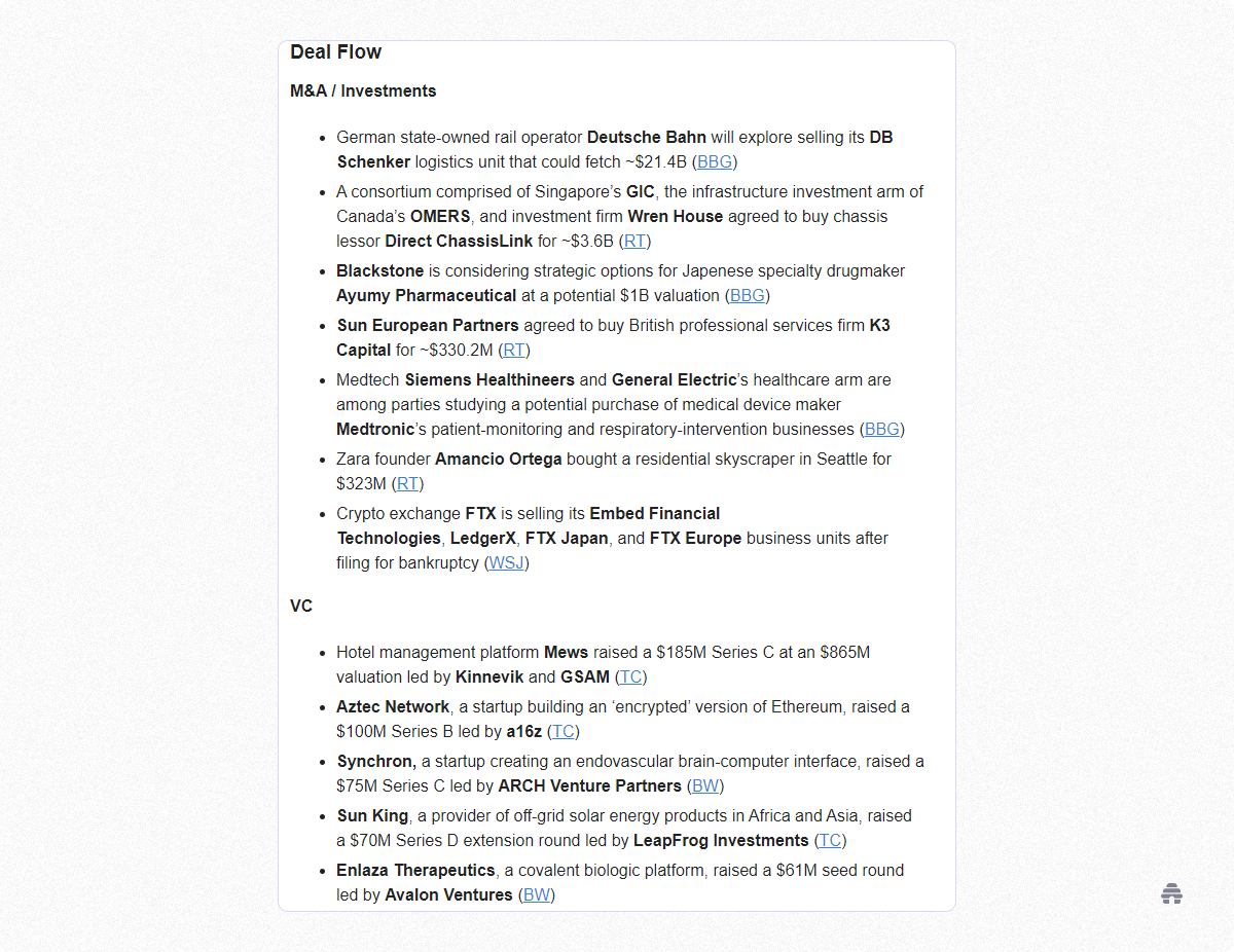
The Exec Sum newsletter is a daily newsletter curating major business news. The selling point of this newsletter is that you get all of the business news you need in a quick-hitting format that gets straight to the point.
Exec Sum has also used the beehiiv template creator to make a reusable format.
Do you see a pattern here?
In some ways, though, they have taken a completely different approach from the others. Instead of using images, emojis, or color changes to break up their text-heavy sections, they have chosen to go with a quick and simple bullet point-based newsletter.
This means their audience can quickly get what they signed up for–business news–without any of the distractions. All the Exec Sum team needs to do each day is scan their sources, write the headline, and include a link to the article.
To add another element of interest for their audience members, each newsletter ends with a meme-cleansing section. Having a unique section to end your newsletter capitalizes on curiosity and adds an extra incentive to scroll through to the end of the email.
Takeaways from Exec Sum:
Extreme minimalism--include just the specific news and information your readers want
End with a unique section (the meme-cleansing section) to keep your readers curious enough to scroll to the end
Create a reusable template with tools such as the beehiiv editor

Even The Odds by Overtime
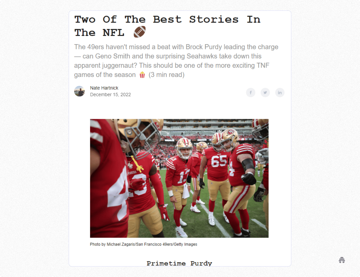
Even the Odds is a newsletter covering stories behind the most popular sports bets. The newsletter has a distinctive design and font that stands out to its readers. They also use a consistent format regardless of the sport covered so its audience is familiar with what to expect in each email.
Each newsletter is broken out into the same sections–the only thing that changes is the content. The consistent, templated design means they can spend their time on substance over style–each newsletter includes a trivia question with an answer at the end.
This simple-to-add feature, thanks to the beehiiv editor and template creator, encourages the audience to stick around through the second half. The question and answer sections have a green background color that matches their theme and draws the eye, maintaining the reader’s momentum.
Takeaways from Even the Odds:
Use a consistent format, even when your subject matter changes
Highlight a section using a background color that matches your theme
Include a trivia question and answer to keep your subscribers engaged
Ponderer
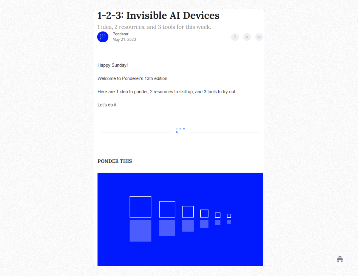
Ponderer is an AI newsletter with a pleasingly simple format.
Each weekly edition includes 1 idea, 2 resources, and 3 tools. This 1, 2, 3 format makes the newsletter an easy read. Subscribers know exactly what to expect, and it won’t take a lot of time or effort.
Ponderer’s simple template takes a lot of cognitive load off the reader, not to mention the creators who produce the newsletter.
To add a special touch, all the graphics in Ponderer are animated. The screenshots you see above don’t do it justice. Check out Ponderer for yourself.
Learn about newsletter design from the founder of Ponderer here.
Takeaways from Ponderer:
Be consistent so your readers know what to expect
Less is more--don’t tax your reader’s cognitive energy, or your own
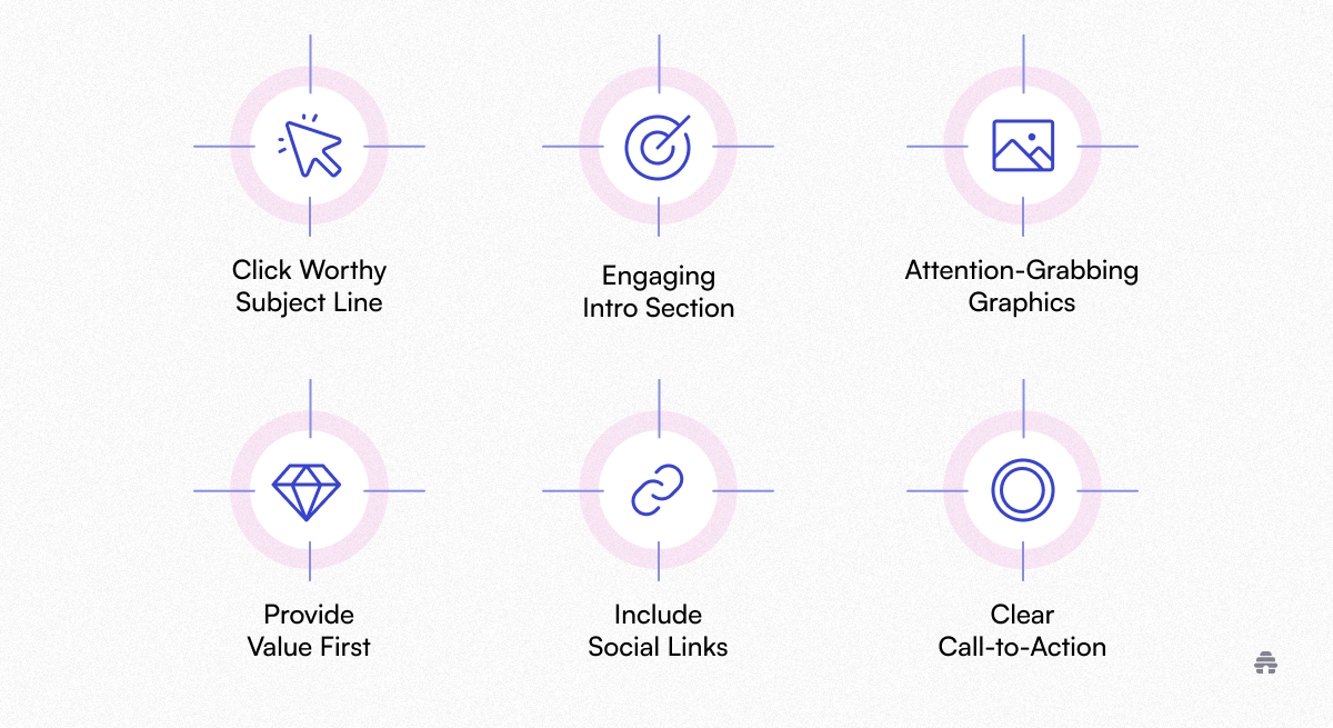
Some elements must be included in every successful newsletter template. Creating your own unique template is a great way to stand out to your readers. When creating those templates, be sure to keep the following in mind.
Click Worthy Subject Line

Think about your own inbox each morning when you wake up. If you’re like me, it’s probably filled with a dozen or more emails that need to be sorted through. Unworthy emails are discarded without ever being opened.
To avoid this sad fate for your email, be sure it has a subject line that will stand out to your audience. This is the biggest factor in achieving a high open rate for your newsletter emails. Subject lines are typically a critical part of the template. Without a great subject line, nothing else on this list will matter, because the email isn’t going to be read.
Here are 44 subject line ideas to get you started!
Engaging Intro Section
Your newsletter’s intro section should give a taste of what your readers can expect in that edition. Many newsletters now are opting for a quick-hitting summary of one-liners that highlight that newsletter’s content.
The B-Side, for example, uses an engaging intro news piece, such as its “National Cupcake Day,” or “Check Your Bank Accounts,” to grab the reader’s attention. Then, they give a few emoji-led lines of what content is contained in this newsletter.
Attention-Grabbing Graphics
This is something all the newsletters we mentioned above have done with great success.
There are many ways to create great graphics. Find a theme that fits your brand and content, then run with it. Great visuals will help to pull your audience through the newsletter. The graphics help to keep readers engaged from start to finish.
Simplicity
We’re living in the era of information overload. Help your readers parse through the abundance of information with a digestible format such as the one used by Ponderer, or a design that contains almost nothing beyond essential information, such as Exec Sum.
If this minimalist approach isn’t your style, do what you can to keep your newsletter approachable. This will keep your readers engaged while production on your end takes less time.
Provide Value First
Anybody running a newsletter is doing so for one reason–typically, to make it profitable.
So, as tempting as it may be to shoehorn in as much promotional content as possible and make more from each newsletter sent, resist that temptation. Your audience is following you for the value you are providing them–not the promotional content.
You can follow whichever rule you feel is appropriate, but the 80/20 or 90/10 rules would be advisable to stick to or you’ll risk alienating your audience and lose subscribers as a result.

Be sure to include your social media links in your newsletter. The beehiiv editor allows you to include these at the top or bottom of your newsletter automatically.
Regardless of what template you choose to use, having social media icons for easy sharing of your newsletter makes for a fantastic way to skyrocket your subscriber count.
Learn how to add in-line social share buttons on beehiiv here.
Clear Call-To-Action

Ask your audience to take action. This is your chance to make the newsletter profitable or to help grow your readership more.
You may ask your readers to share the newsletter with somebody they think would enjoy it, buy something you’re offering, or head to an affiliate site. CTAs work–be sure to include them in your templates.
Read more about the CTAs that drive conversions here.
Mobile-First Template Design
Over 55% of email opens happen on mobile, so your templates must be responsive.
Single-column layouts: Eliminate horizontal scrolling and improve readability.
Font sizes: Use at least 16px for body text and 22px for headlines for legibility on small screens.
Thumb-friendly CTAs: Place buttons in the center or lower area for easy tapping.
Preview across devices: Use tools like Litmus or Email on Acid to make sure your templates render perfectly everywhere.
It's a lesson developers know all too well: don’t rewrite something twice.
The beehiiv editor allows you to save templates so that you won’t need to figure out your layout for each newsletter you send. This feature will save you countless hours and ensure you have a consistent layout your readers can get comfortable with.
If you’re ready to start saving time on creating your newsletters with a fantastic design, sign up for your free beehiiv account today and get growing.
How to Customize Templates for Your Brand
Templates are only the foundation. Personalizing them to your brand is where the magic happens.
Fonts & colors: Stick to 2–3 core brand colors and web-safe fonts for consistency.
Reusable content blocks: Save commonly used sections (like banners or footers) in beehiiv for fast editing.
Dynamic personalization: Add first names or location-based elements for a human touch.
Industry tailoring:
SaaS templates → Data-driven visuals and feature highlight sections.
Lifestyle templates → Engaging visuals, polls, and tips sections.
Finance templates → Clean layouts, minimal imagery, and clear CTAs.

Frequently Asked Questions About Newsletter Templates
(Place this section at the very end)
1. What is the best email template size for engagement?
600 px width is the standard safe size, but make sure it’s mobile-responsive. Height should remain concise (under 1500 px) to prevent fatigue.
2. Should I use one template or multiple templates?
Start with one core template for consistency. Over time, create variations for special campaigns, seasonal updates, or specific audience segments.
3. How do I keep templates from feeling repetitive?
Swap out visuals, play with section order, and refresh CTAs while maintaining a consistent structure so your audience still recognizes your brand.
4. Can I add personalization to beehiiv templates?
Absolutely. You can insert dynamic fields (like first names) and even tailor content blocks based on subscriber tags or segments.
5. What are the most common template design mistakes?
Overloading with images (hurts deliverability).
Poor mobile optimization.
Cluttered layouts without clear CTAs.
Ignoring accessibility (e.g., missing alt text)


