


Landing pages aren’t popular—at least among newsletter publishers.
But guess what? Newsletter landing pages have the highest conversion rate of all signup forms.
According to Omnisend research, newsletter landing pages have a 23% conversion rate, yet, oddly enough, landing pages are the least popular signup form for publishers to create.
While there are a variety of tools to grow your email list, landing pages are something worth paying attention to. If you’re looking to convert more of your visitors into subscribers and grow your newsletter, then keep reading.
Remember, you could have the most engaging newsletter of all time, but it won’t do you any good if you can’t get people to sign up for your list.
If you’re not sure where to start when it comes to crafting a successful landing page, we’ve got you covered. In this article, we’ll give you five prime newsletter landing page examples you can emulate to get your marketing juices flowing.
Let’s dive in.
What They Do Well:
An impressive animated logo (visit the signup page to see it for yourself)
Targeting a specific audience
Loads of social proof
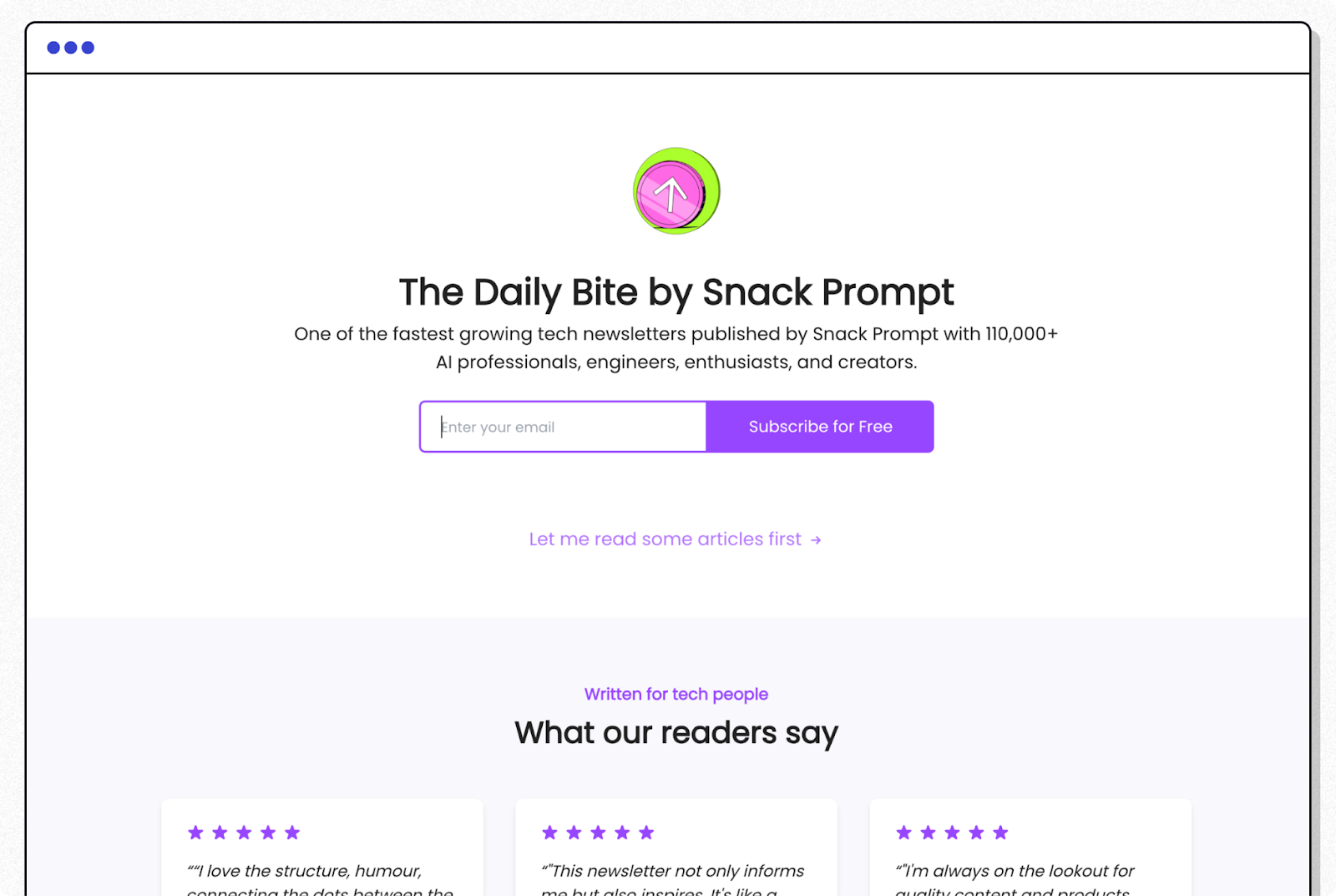
When you visit the landing page of The Daily Bite, the first thing that will catch your eye is their animated logo. This is a newsletter for AI enthusiasts, so it makes sense to have some tech-heavy fun right at the top.
The next thing you'll notice is all the social proof they offer about their newsletter. The description says, “one of the fastest growing tech newsletters,” and mentions 110,000+ subscribers.
Then right underneath the form, you see testimonials from educated readers.
The daily bite also targets a specific audience. This is important because there are a lot of newsletters about AI. To differentiate, The Daily Bite makes it clear that this one isn't for muggles, stating it is “written for tech people” in bold, purple lettering.
If you're a poet whose favorite text devices are a fountain pen and a leather-bound notebook, you'll know right away to give this one a hard pass. But if you're the data scientist at a startup, The Daily Bite will reach out and grab you.
2. Milk Road
What They Do Well:
Headline concisely breaks down their value proposition
The subheadline shows great social proof and how often to expect a newsletter
Two places to enter email (including a scrolling footer popup)
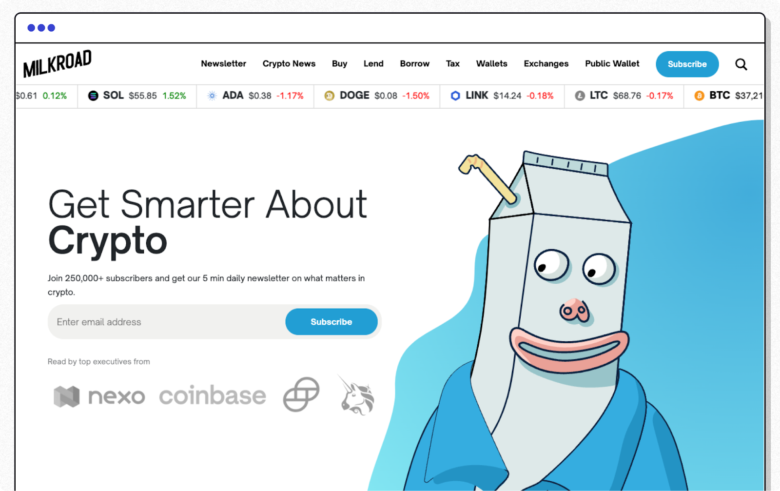
Milk Road is something special. Their newsletter—built on beehiiv—is one of the most popular crypto newsletters in the world. In fact, they were acquired just 10 months after their launch! Their landing page does an excellent job of showcasing exactly what kind of newsletter they are and who it’s for.
They lead with a clear and concise headline: “Get smarter about crypto.” They also don’t shy away from social proof. They show off how many subscribers they have twice on their landing page. Plus, they highlight a feature review and logos of authorities (i.e. Coinbase, Binance) who read their newsletter. Finally, they display a graphic of their newsletter being read on a smartphone to help each visitor visualize themselves as a subscriber.
What They Do Well:
Crisp, clear headline
Set the right expectations in the subheadline
Leverage social proof through their example newsletter graphic
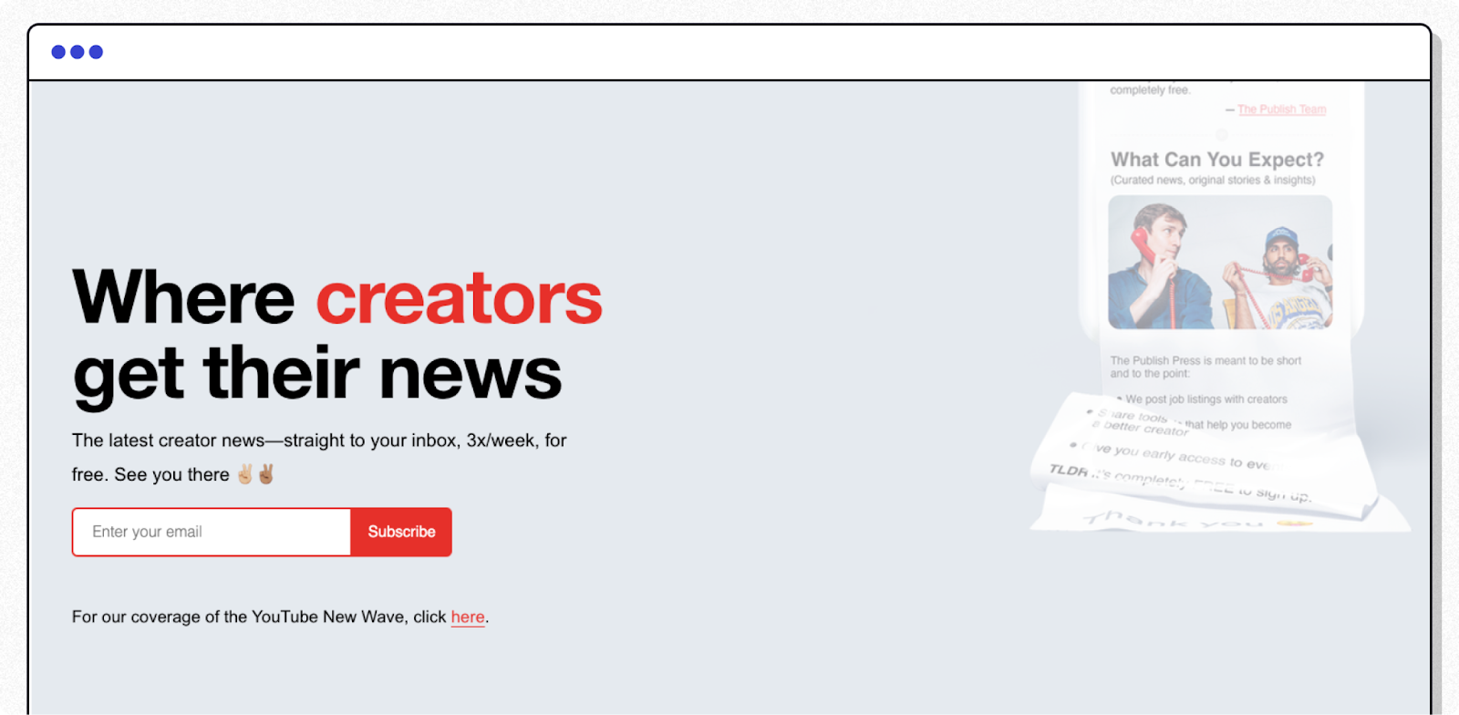
Colin and Samir, the famed YouTubers, launched their own newsletter for creators. They do a great job with their newsletter landing page, with a bright, vibrant design.
Their landing page features a crisp, clear headline: “WHERE CREATORS GET THEIR NEWS.”
They also excel in the expectations department. One crucial part of running a successful newsletter is setting the right expectations with your readers. Their subheadline reads: “The Publish Press delivers the latest creator news—plus why it matters—straight to your inbox, 3x/week. See you there ✌🏼✌🏽.”
So you know right out of the gate, you’re going to receive three newsletters every single week. And the content inside? It’s all about creators.
One striking aspect of their landing page is their smartphone graphic displaying an example of the Publish Press newsletter. On the graphic, they show off the pretty faces of some of the top creators. The featured creator they show is Mr. Beast, a creator with 128 million YouTube subscribers. Showing off an authority figure in your niche like Mr. Beast is a smart way they leverage trust and expertise without having to display a proper endorsement from Mr. Beast himself.
4. Payload
What They Do Well:
Impressive call to action
Three calls-to-action for several chances to sign up
Excellent trust signals and social proof
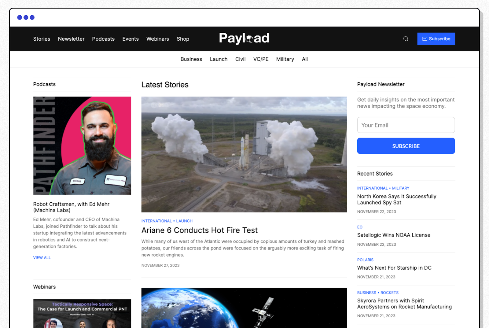
Payload is a newsletter all about space, particularly when it comes to the business side of the industry. They have a solid scrolling landing page that covers all the essentials and more. Their headline, “We cover the business and policy of space,” is followed up with a great call to action, “Join thousands of space leaders today.” The call to action speaks directly to the visitor, telling them that by subscribing, they’ll be joining alongside leaders in the industry, sparking a bit of FOMO.
Their landing page is filled with nicely designed social proof featuring a banner of authoritative organizations that read their newsletter, followed by three reviews from C-suite executives from top space organizations. To top it off, they offer three subscription forms so readers have multiple chances to sign up.
5. Homescreen
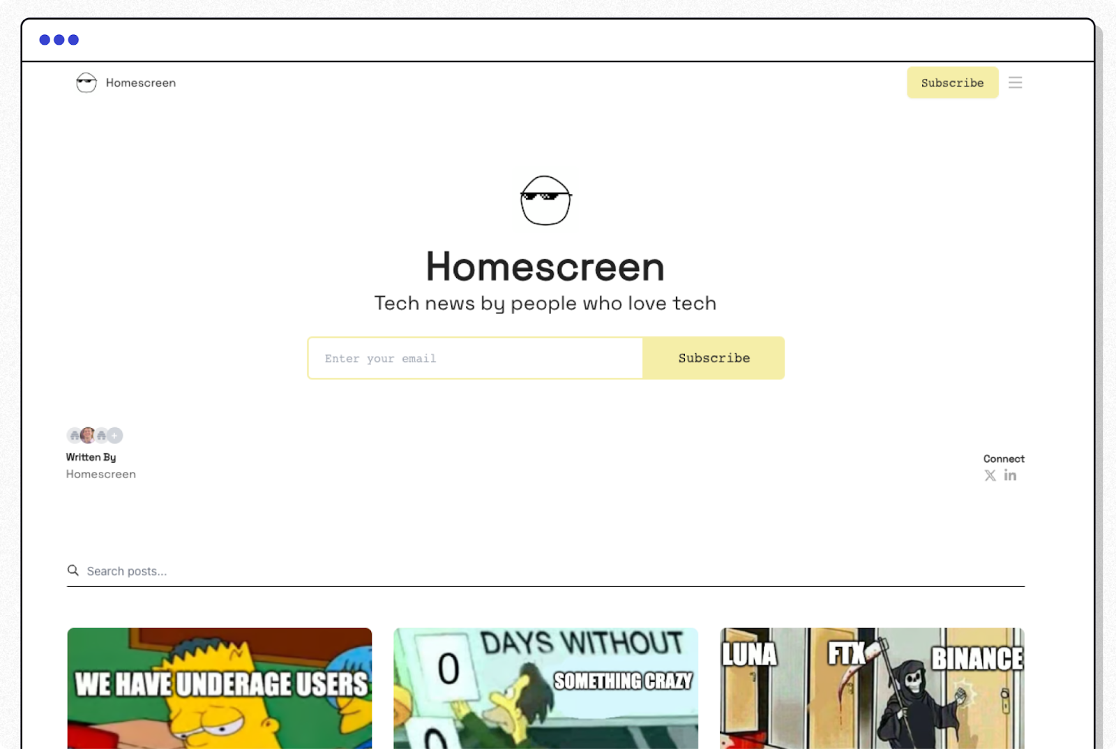
What They Do Well:
Offer visually enticing graphics and design to keep visitors engaged
Clear value proposition differentiating themselves from other biz newsletters
A+ in communicating the benefits of their newsletter
The homescreen has one of the most captivating newsletter landing pages we’ve seen. Their landing page is popping off with hilarious memes and graphics of their sleek-shaded mascot. Homescreen’s newsletter is all about news for founders.
Their landing page makes it clear that they’re not just another business newsletter. They make it clear what makes them unique. Fun, engaging content that’s driven by humor, as summed up in this quote from their page, “Homescreen is like if TechCrunch and Morning Brew had a baby.”
Something they do really well is hyping up the value in their newsletter. Rather than relying on a simple headline and call to action, they expand even more by showing off “The Details,” showing you what to expect in each email: News, Resources, and Humor.
As they’ve written on their landing page, “In our eyes, it’s a crime to write a boring newsletter.”
6. Fantasy Life
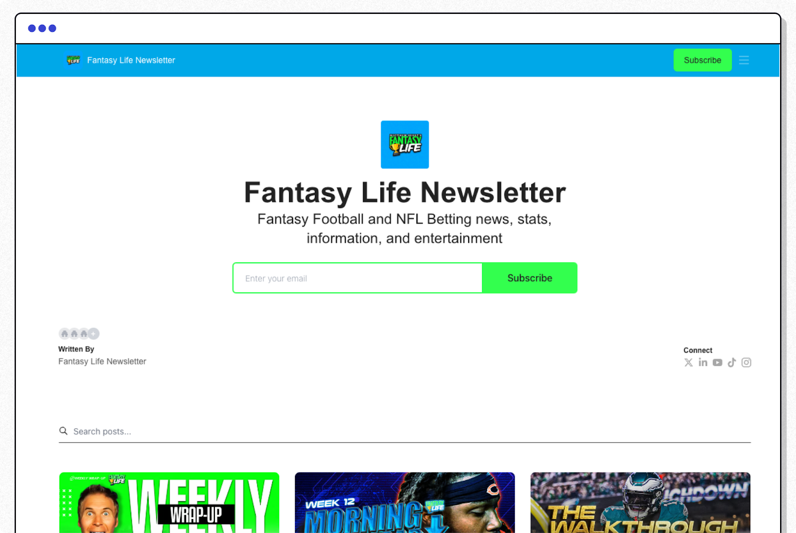
What They Do Well:
Clear, bright call to action
Sample newsletters to give visitors a taste of the newsletter
Simple landing page leading to two clear CTAs
Fantasy Life is a football newsletter founded by Matthew Berry, one of the leading sports and fantasy football faces in America. The newsletter covers up-to-date fantasy football information, so subscribers can make informed fantasy and betting decisions.
Their landing page features a simple, yet clear call to action. You’ll find it front and center, capped with a bright green subscribe button that visitors won’t miss.
Fantasy Life’s landing page also includes a handful of the latest newsletters to give readers a sample of what it’s like being a subscriber, followed by a second call to action at the footer to drive traffic to their signup page.
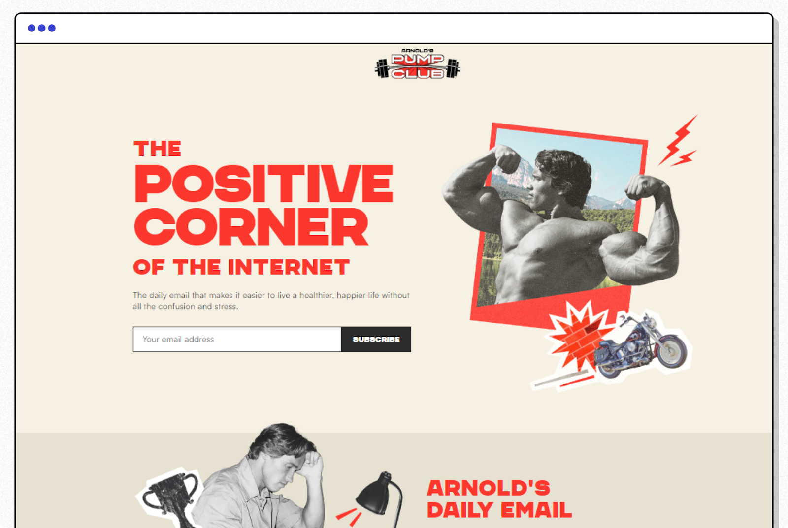
What They Do Well:
Immediately clear that this is a positive and supportive newsletter
Visually interesting contrast of black and white photos with letters and patches of vivid red
Use of encouraging words such as “simplify,” “easier” and “positive”
Arnold’s Pump Club is a health and fitness newsletter created by the world-famous bodybuilder, film star, and former governor of California, Arnold Schwarzenegger. The celebrity effect alone would make this newsletter a success, but the landing page is well-designed.
Black and white photos from the ‘80s provide a vintage appeal. You get the sense this is going to be a classic, old-school experience. Bits of bright red (the only color used on the landing page) leap out at you, punctuating the photos and graphics.
The visual contrast and animated Terminator motorcycle grab the eye. Seeing “The Positive Corner of the Internet” in big red letters suggests a welcome haven from the toxic trolling that plagues the online environment.
Finally, the text above the subscription form offers both a promise and reassurance: “A healthier, happier life without all the confusion and stress.” Who could say ‘no’ to that?
Email newsletters are one of the most effective ways to connect and engage with your audience. Since your newsletter landing page is likely the first impression you’ll make with your target audience, it’s important to ensure that it’s well-designed.
A compelling landing page is crucial if you’re looking to grow your newsletter subscribers over time. You may be wondering, how do I create a newsletter landing page?
Here are a few tips:
Start with a bold headline summarizing what your newsletter offers.
Add an image (or two) that grabs your visitor’s attention.
Highlight the value of your newsletter (what’s in it for them?).
Set clear expectations (the type of content and how often you’ll publish).
Add a strong call to action.
Remember, creating a landing page for your newsletter is relatively easy, but it’s not easy to make it a good one.
The Psychological Elements of a Newsletter Landing Page
When a visitor reaches your newsletter landing page, only two things can happen. Either they subscribe, or they leave.
The most important job for your landing page is to inspire users with a deep desire to sign up. Here are some psychological tips to help your landing page succeed:
Make it fun. Bright colors and cartoony graphics such as the Milk Road mascot create a fun environment that readers will want to join
Make your readers feel smart. Payload gets directly to the point: News that impacts the space economy. Anyone who reads the call to action is going to feel like they are forward-thinking, informed, open to new investment opportunities, and “in the know” compared to mere mortals.
Play on the reader’s identity. People make choices based on an image of the life they want to have and the person they want to be. These landing pages appeal to the user who identifies themself as a Creator (The Publish Press), tech-savvy (The Daily Bite, Homescreen), or physically fit (Arnold’s Pump Club)
Remove friction. The less effort involved, the more likely a user will subscribe. Note that every email newsletter landing page example we've shown you has a one-field subscription form and just a single sentence describing what the newsletter is about. This feature is inherent in the beehiiv platform. Once a subscriber is on board, you can ask for additional information if you need it.
Scale users can customize a landing page with a few clicks. Here’s how it works:
Start by visiting your Settings → Design Lab → Landing Page.
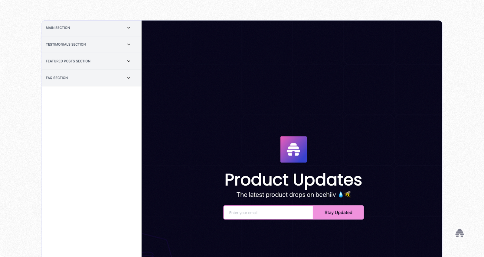
You’ll notice right away that there are three sections: a main section, a Testimonials section, and a Featured Posts section.
The main section is where you will find most of the “above the fold” content.
Click on anything here. Go ahead. You can edit the backgrounds, headers, text fields, images, etc., without writing code.
Next, let’s look at the Testimonials section.
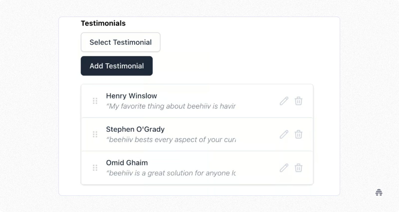
As you can see, you simply click “Add Testimonial” to add a testimonial.
You can drag and drop each testimonial, and then edit or delete them using the icons on the right.
By the way, you can also toggle off the Testimonial page if you don’t want your readers to see it.
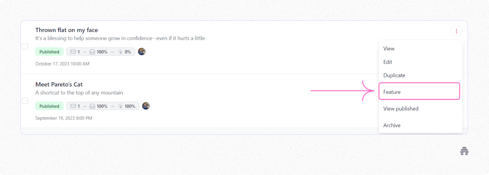
Finally, there’s the Featured Posts section.
As with the Testimonials section, you can toggle this section on or off to hide it.
To feature an article, go to Write → Posts from your Dashboard. Click the three dots next to the post you want to feature and select “Feature” from the dropdown menu.
You can watch the entire landing page process in this 8-minute tutorial. And it won’t take you much longer than that to build a custom, SEO-optimized landing page.
If you’re looking to launch your first newsletter and you’re not sure where to start, you’ll want to check out beehiiv. There’s no easier way to set up a newsletter landing page anywhere else in the newsletter space than with beehiiv.
We’ll walk you through our simple signup form creator; and in just two minutes, you’ll have a working landing page. With beehiiv’s newsletter platform, you get your own landing page that features a simple signup form, followed by your latest newsletters, and finally, a second call to action—so you can turn more visitors into subscribers.
If you’re ready to grow your newsletter, sign up for a free beehiiv account today!

