Landing page designs can make or break your conversion rates.
According to Unbounce, the average landing page conversion rate across all industries was around 6.6% as of Q4 2024. So, if your conversion rates are below that number, there’s definitely room to grow.
Over the past few years, I’ve tested and studied dozens of landing page template websites. Some looked amazing but flopped. Others looked basic but converted like crazy. It turns out that it’s not always about a fancy design, but how well a landing page guides your visitors to take action.
In this article, I’m sharing the nine landing page designs that are proven to work well and can help you boost your conversion rates.
Why Trust Me?
I’m an SEO expert and content writer. I help B2B and SaaS companies show up in organic search results. I’ve also grown my own website, Self Made Millennials, to more than 15,000 monthly visitors with around 100 indexed pages.
Table of Contents
Why Landing Page Design Matters More Than You Think
Landing page design matters because the first impression happens fast. When someone lands on your web page, they decide whether to stay or leave in seconds. That decision is often based on how a page looks and feels.
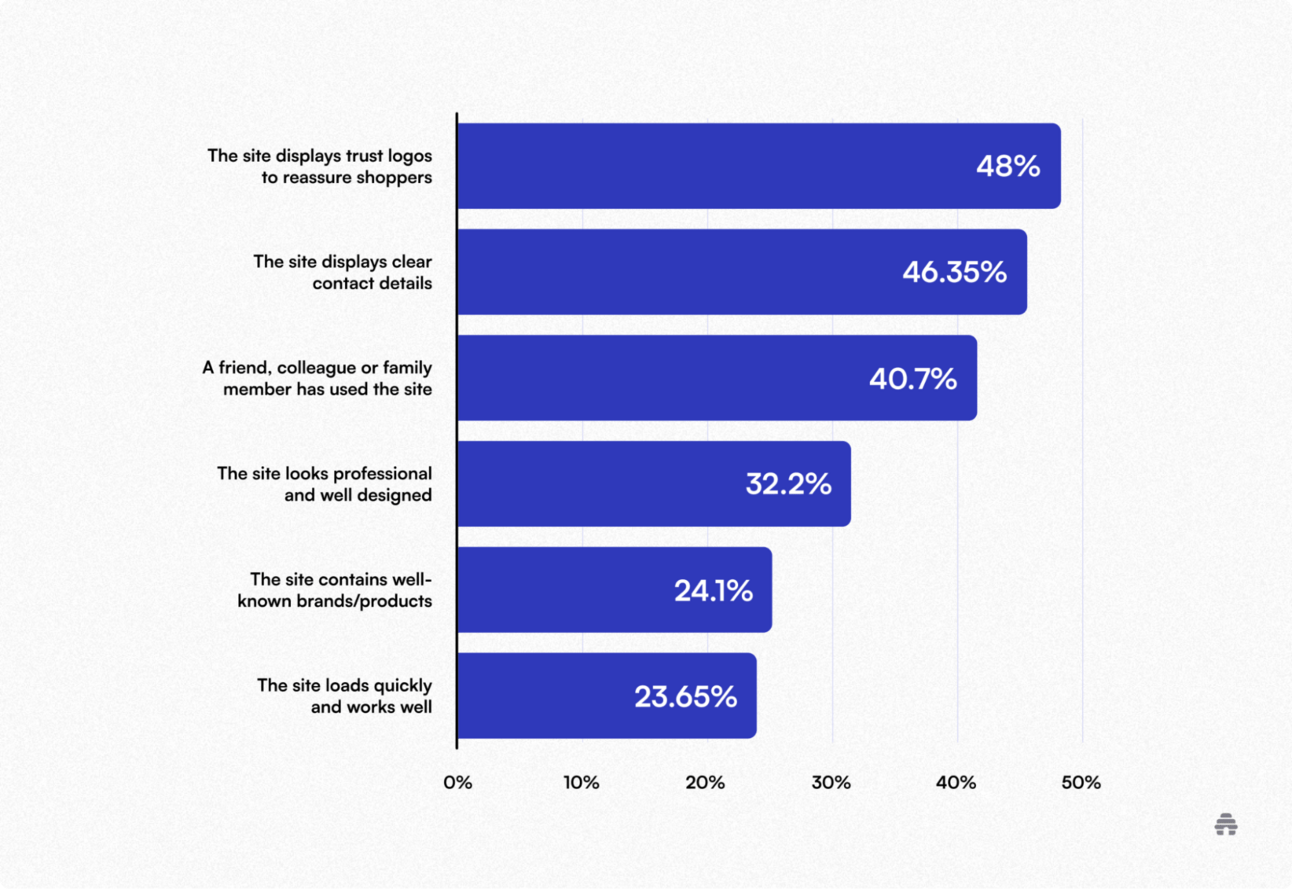
According to a survey conducted by Econsultancy, when users were asked what makes them trust a website they don’t know well, the top answers were seeing trusted logos and having contact details.
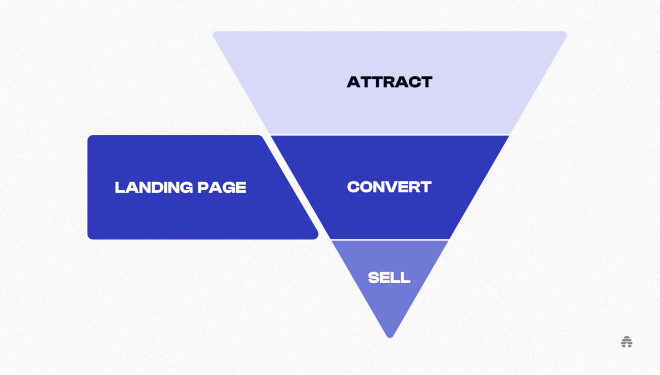
Landing page design isn’t just about looking nice, but it’s about guiding people.
A layout with a clear visual hierarchy helps users understand where to focus, what to do next, and how to take action. A well-placed call-to-action (CTA), simple navigation, and resonating content can turn visitors into customers.
9 Landing Page Designs That Can Turn Visitors Into Customers
If you are wondering how to create a landing page for free, let me show you nine examples of landing page design that can help turn your website visitors into subscribers and paying customers.
I’ve personally used some of these designs for my lead magnet and newsletter homepage. But I’ve also included a few great examples from others so you can see how each design works in action.
1. The Clean Fold Design
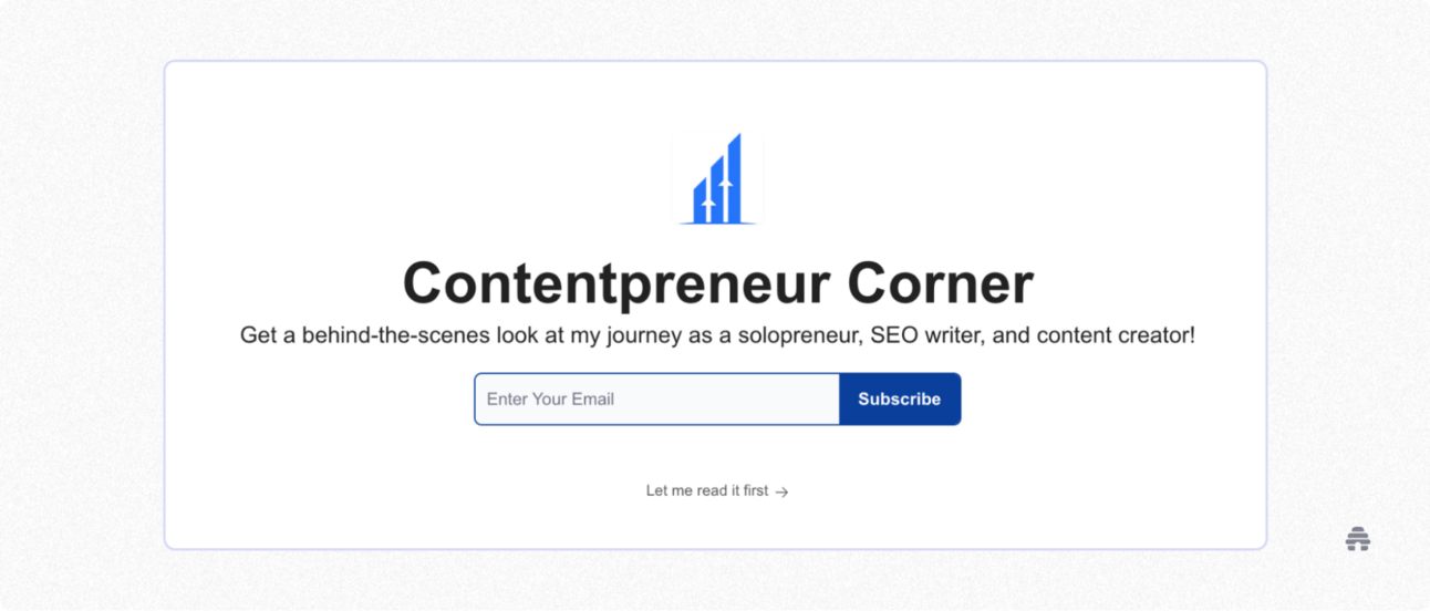
The Clean Fold landing page design includes a few elements, like a logo, a one-line copy, and a call to action. That’s it! The goal is to grab email addresses quickly without overwhelming visitors with too much information.
What you see below is a classic example of a Clean Fold landing page I built using beehiiv. It’s clean, minimal, and gets straight to the point. I use this page across different marketing channels, and it’s one of my best-performing landing pages.
If someone’s not totally sold by my first line, I give them another option—a “Let me read it first” button. It’s a way to say, “Hey, no pressure! Check out my stuff before deciding.” Even if visitors aren't unsure, they still get a feel for what I do.
If you want to build your own high-converting landing page like this, check out beehiiv’s landing pages 101 guide. It can help you create simple and visually appealing landing pages.
2. The Split-Screen Offer Page
A Split-Screen Offer page is a website layout where the screen is split into two or more sections. It lets you show different offers side by side, including products or features, all at once.
I’m not a big fan of this design type, but I can see why people like it. It lets you highlight a few design elements simultaneously and helps direct people’s attention to where you want them to look.
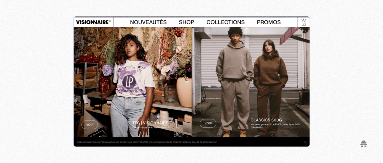
Fashion websites often use this landing page layout to split the screen between men’s and women’s collections.
Take Visionnaire, for example. It’s a casual clothing brand from Toulouse with a young and modern vibe. Their website starts with a bold, colorful split-screen section that shows off their latest collection.
3. The Centered Form Layout
The Centered Form Layout landing pages are typically long and have persuasive content.
You’ll often see long-form copy explaining the offer, who it’s for, and why it’s worth the money. There are multiple CTA buttons throughout the page to help users take action whenever they’re ready, whether that’s at the top, in the middle, or at the bottom of a page.
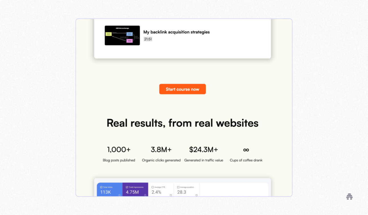
Omid G, a content creator and the founder of Marketer Milk, powered by beehiiv, has a great example of a Centered Form Layout landing page design for his content marketing course.
The page is pretty long and informative, breaking down the value of the course and what you’ll get out of it. Since the page is long, there are many calls to action placed all over it. The goal is to meet users where they are and help them take action when it feels right.
In my opinion, this layout works well for high-ticket items like online courses, where people need more time and information before buying. And clearly, it works! Omid’s page helps turn visitors into paying customers.
The Social Proof–First Page is designed to build trust with visitors when they land on your site.
Instead of starting with product features or long blocks of text, this design type focuses on social proof. It means featuring client testimonials, impressive business numbers (like how many happy customers you’ve helped or how many products you’ve sold), and recognition from well-known companies or experts. These elements help show that your brand is trusted, credible, and worth paying attention to.
The goal is simple: gain trust fast so visitors are more likely to take action.
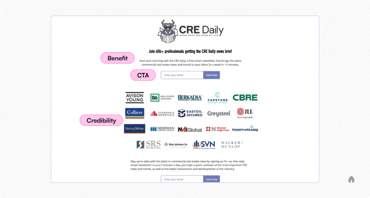
For example, the CRE Newsletter, which sends 5-minute daily emails on commercial real estate trends, includes company logos and the number of subscribers to inform users about the credibility of their brand. This kind of social proof makes people feel more confident that they’re making the right choice by engaging with the brand.
5. The Quiz-Style Flow
The Quiz-Style Flow landing page is all about getting people to interact.
Unlike other landing page types that throw information at you, this one makes you do something, like take a quiz, answer a few questions, or try a tool. It’s a fun and engaging way to pull users in, and it often offers something valuable in return, like a score, a report, or a free result.
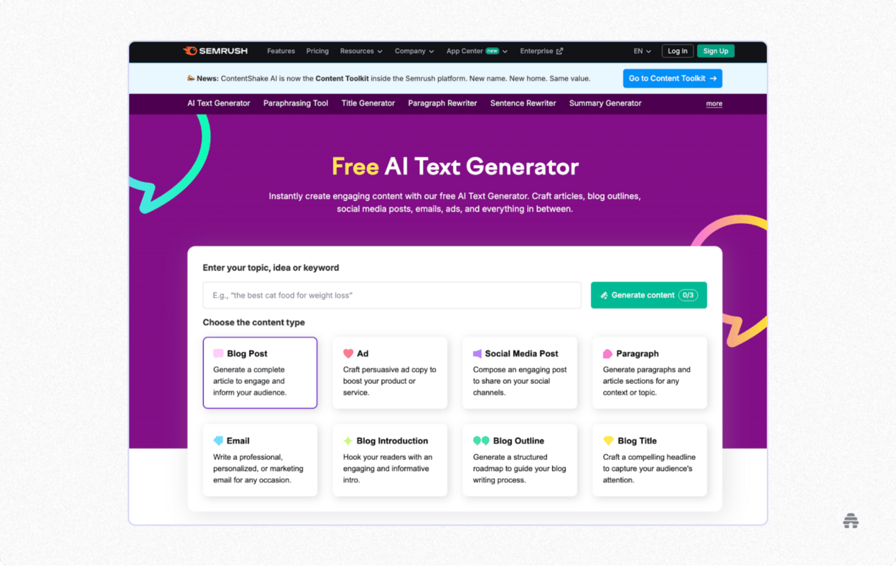
You’ve probably seen tons of these. One of my favorite examples is how Semrush does it.
Semrush lets you test out some of their tools for free, like their AI Text Generator. While you're checking them out, they’ll casually remind you to sign up, using CTA buttons and popups when you’re about to leave the page.
You're not forced to do anything. However, the page is built to make you curious, keep you engaged, and eventually convert you into a paying customer.
6. The Lead Magnet Squeeze Page
A Lead Magnet Squeeze landing page can help you collect email addresses in exchange for a free resource, like a case study, an ebook, or a checklist.
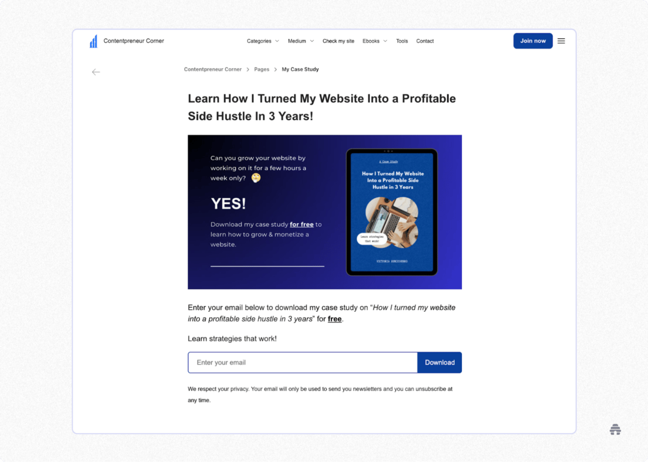
I use this type of page to encourage readers of my Medium blog and website to download my free case study. It’s a short ebook where I share how I grew and monetized my site with hands-on strategies that worked for me.
As you can see below, the layout is super clean. There’s just one call to action: “Download.” This makes the decision easy and helps boost conversions.
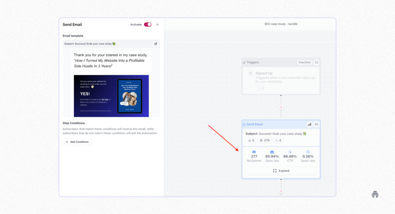
I once used this page as part of a bundle with other creators to grow my email list. In just a few weeks, 277 people downloaded my case study with a click-through rate (CTR) of 66.48%. That’s a pretty good sign that the page and the offer worked!
With beehiiv’s features, you can also create lead magnet pages. beehiiv lets you build stand-alone pages, full websites, and use subscribe forms to grow your audience with no tech skills required!
7. The Product Tease Page
The Product Tease landing page type provides a sneak peek into something exciting that’s coming soon. The goal is to promote a product before it officially launches.
Creators and companies use it to either presell a product or collect a waitlist of people who are already interested. It’s one of the most helpful types of landing pages because it helps validate your idea before spending time and money building it.
I used this exact page type to presell 23 copies of the 4th edition of my SEO ebook before I even launched it! The sales I made helped justify all the time I was about to invest, plus it covered the cost of hiring a designer to make the ebook look professional.
You’ll often see creators use this approach to sell high-ticket online courses. They promote the course, presell their products, and only then start creating the content.
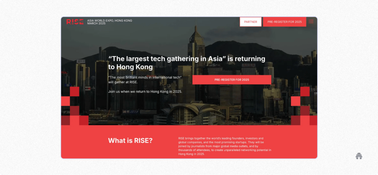
Another great example is how RISE uses this landing page type to collect pre-registrations for their big events. Think of it like a party invite: you know what you’re signing up for and when it’s happening.
8. The Fullscreen Image CTA
The Fullscreen Image CTA landing page usually features one big, eye-catching image, a short line of text that explains what you're getting, and one clear CTA, like “Subscribe” or “Join Now.”
That’s it. No scrolling, no distractions.
This type of landing page has one goal: to convert visitors into subscribers.
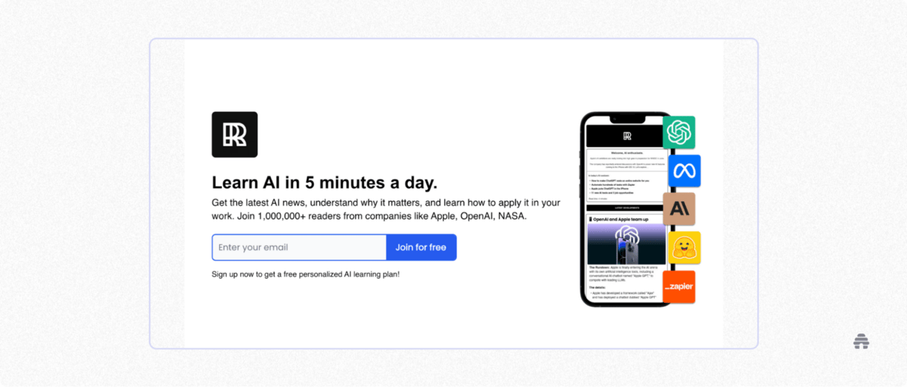
A great example of this is The Rundown, an AI-focused newsletter powered by beehiiv with over 300,000 readers. Their landing page uses a clean design, strong social proof, and a single CTA to collect email addresses fast.
9. The Link-In-Bio Layout
The Link-in-Bio landing page acts like a hub for all your important links.
It’s primarily used for social media platforms, like Instagram, TikTok, or Reddit, where you can only add one clickable link in your bio.
The one link can feel limiting, especially if you want to share multiple things: a blog, newsletter, shop, or podcast. That’s where the Link-in-Bio landing page type comes in handy. Instead of choosing just one destination, you can create location landing pages that list everything you want people to check out.
In my case, I usually send people to my website, which has all the key info about me and my work.
But what if you don’t have a website? No problem. With beehiiv’s Website Builder, you can create a clean, simple Link-in-Bio page in minutes.
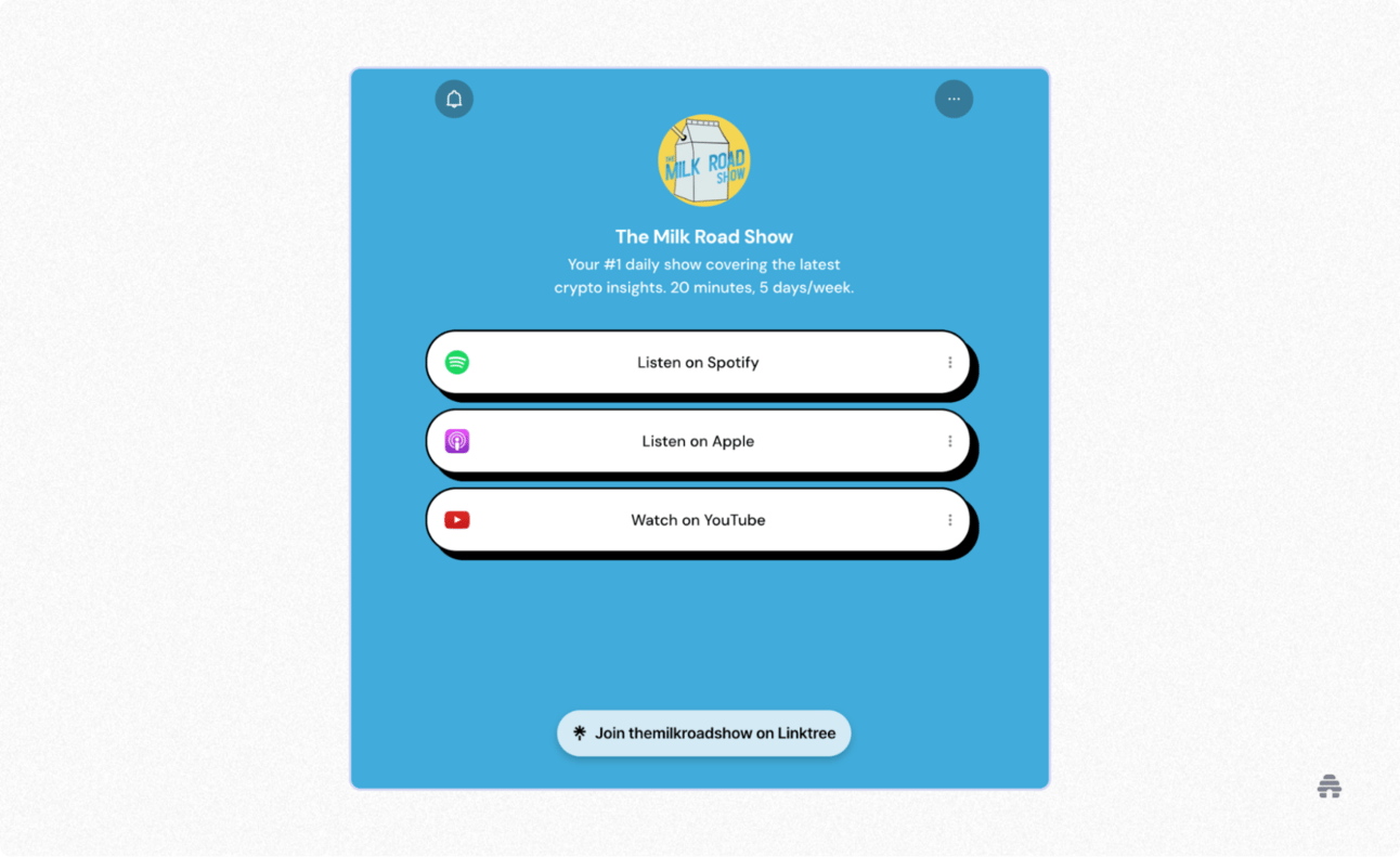
A great example is the Milk Road Show, a newsletter that shares daily crypto news. They use Linktree to send people to their podcasts across Spotify, YouTube, and Apple.
Common Landing Page Design Mistakes I’ve Learned To Avoid
After creating dozens of landing page template websites, I’ve learned what not to do the hard way.
Some of my early pages looked nice, but converted terribly. That’s when I started digging into the “why” and realized I was making some mistakes.
Here are a few mistakes I’ve learned to avoid:
Too many links: I used to include many links, thinking it would give people more options. But in reality, it only distracts users from the target action, like signing up or purchasing.
Vague CTAs: “Learn more” or “Get started” without context don’t mean anything. I suggest being specific about what happens next.
Cluttered visuals: Visuals should support your message and help users make a purchase or signup decision faster.
Too many form fields: If you ask for too much information upfront (like phone numbers or birthdays), people will likely give up and leave.
No clear headline: Some of my early pages buried the main message. Visitors didn’t understand the purpose of my landing page.
No social proof: Testimonials, logos, success stories, and achievements help build trust. And trust leads to sales.
Each of these mistakes came from pages I built and watched underperform. So, if you work on landing page designs, hopefully, my learnings will save you from a headache.
Where I Design My Landing Pages
I’ve tested many platforms to build landing pages, from Canva landing page templates to WordPress, beehiiv, and website builders, like Wix and Webflow.
Here are my go-to options with pros and cons for each:
beehiiv: My personal favorite. It’s one of the best email newsletter services and audience growth platforms. Its no-code Website Builder makes it easy to create landing pages and full websites optimized for rankings. You can also naturally embed signup forms to grow your email list and nurture your audience. I wish there were more design customization options, but I’m sure that’s coming.
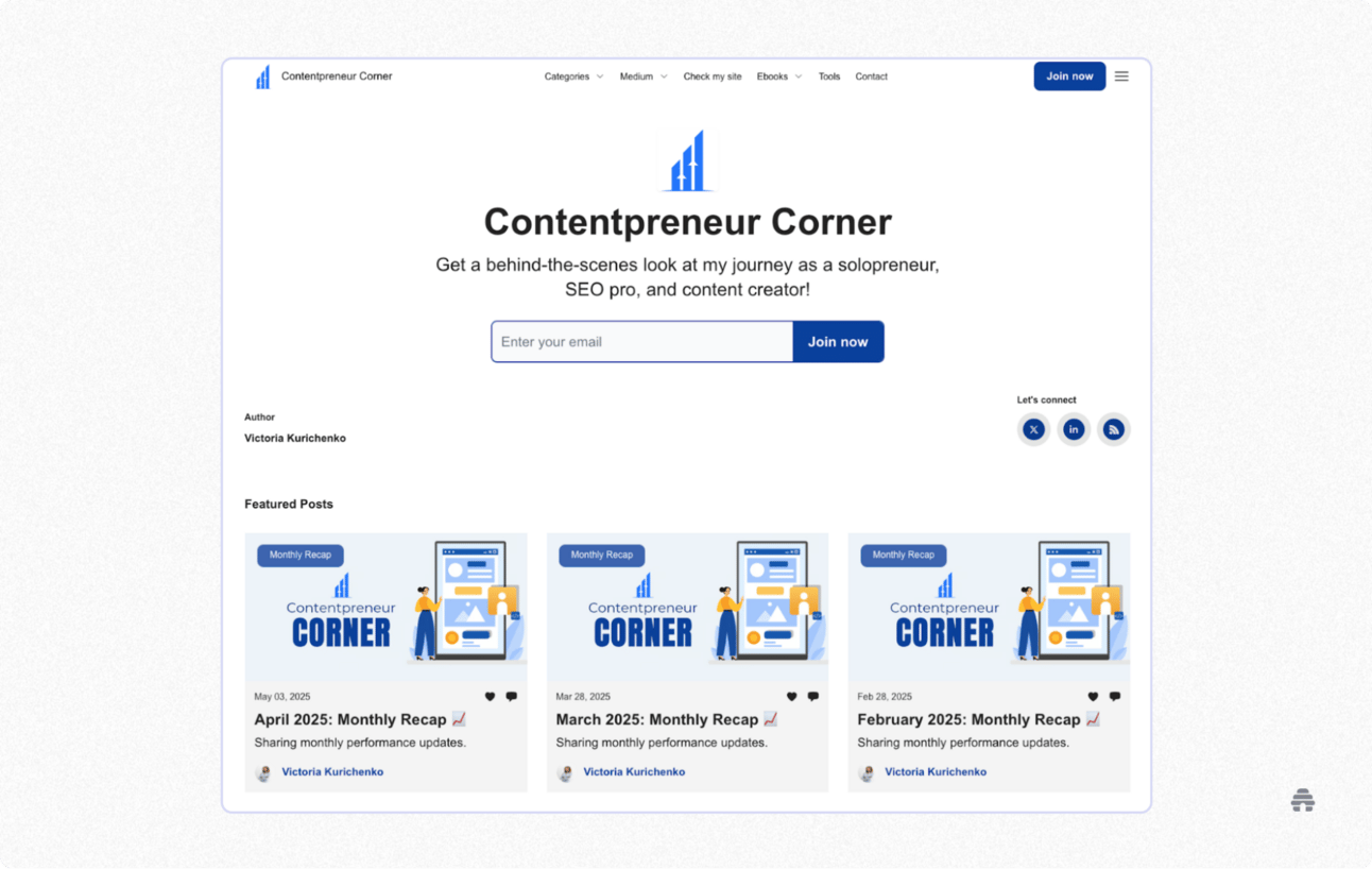
Here’s the home page of my website on beehiiv where I host my newsletter editions.
Carrd: It’s suitable for simple, one-page sites. It’s user-friendly, affordable (free to start), and has clean templates. In my opinion, it’s not suitable for building a decent website, as advanced features like forms or custom domains require a Pro plan.
Webflow: Great for creatives who want total control over their design. It’s flexible and powerful, but there’s a learning curve. You’ll need some coding knowledge, and it can feel a bit overwhelming at first. It's not ideal for beginners, but it could be suitable for more advanced users.
Unbounce: I’ve used this one for paid ad campaigns. It’s excellent for quick, high-converting landing pages. No coding required, and you can set up popups and track conversions. Keep in mind that custom domains are only available on paid plans.
Notion: It’s a productivity and note-tracking software, but people use it to create landing pages as well! It’s clean and easy to use, and you can publish any page with a single link. However, customization is limited, and it’s not ideal for SEO purposes. Still, it's great for sharing info quickly.
How To Align Landing Page Design With Your Goals
When it comes to landing page design, it's essential to ensure it supports your business goals. Your landing page should be like a helpful guide that leads visitors exactly where you want them to go.
For example, if your goal is getting more email signups, try using a clean fold or lead magnet squeeze landing page type. These layouts focus on capturing attention and encouraging people to sign up. A solid email newsletter strategy will also make a big difference!
If you’re launching a new product and want to collect waitlist signups, a product tease landing page is a perfect fit. It can help you highlight your upcoming product, create curiosity, and get people eager to learn more or join your waiting list.
No matter what your goal is, your landing page design should make it simple for visitors to take that next step.
And if you want to create beautiful, high-converting landing pages without coding or stressing about hosting, check out beehiiv! Their Website Builder lets you design pages fast, add forms, and customize everything to help you achieve your goals.
My Closing Thoughts On Designing For Signups
If there’s one thing I’ve learned from testing and tweaking landing pages over the years, it’s this: simple usually wins.
It’s not about having the fanciest design. The best landing pages for me followed one basic rule: one offer, one clear call to action, and a clean layout.
The landing page types I shared in this article are ones I’ve tested myself or seen work in the wild, and they’re a great starting point if you want to boost your own conversion rates.
If you want an easy way to build great-looking pages without coding, beehiiv is worth checking out. I use it myself, and it’s helped me grow my email list faster than any other platform.
And remember, every landing page is a work in progress. Get version one out there because you can always tweak and optimize later.
FAQ
What are Landing Pages?
A landing page is a single web page people “land on” after clicking a link, like from an ad or email. It’s built to focus on one clear goal, usually getting someone to sign up, buy something, or learn more.
What Is the Difference Between a Website and a Landing Page?
Unlike a regular website page, a landing page doesn’t have many links, distractions, or generic content. Instead, it focuses on one message and one action. It’s like a sales pitch that lives online.
Do Landing Pages Cost Money?
Landing pages can cost money, but they don’t have to. It really depends on what you need and how much you’re willing to spend.
There are free tools, which can be great if you’re just starting out or doing something more casual. But if you want more features, like using your own domain or tracking performance, I’d recommend picking a paid tool like beehiiv. It gives you more control and can help you get better results faster.
Who Creates Landing Pages?
Landing pages are usually created by marketers, designers, or business owners, basically anyone trying to get people to take action, like signing up or buying something.
It could be a team effort between a copywriter and a web designer. Solopreneurs or small business owners use tools like Wix or Webflow to build landing pages on their own.
You don’t need to be super tech-savvy to make one with beehiiv!

