

Table of Contents
Have you ever opened an email and been immediately captivated by its engaging header?
Newsletter headers have become a must-have in email marketing strategy.
Studies reveal that 33% of email recipients decide whether or not to open an email based on the subject line alone.
So, how can you ensure that this first impression is positive and compelling enough to make your reader want to dive deeper into your content? How can you design a header that contains your brand's identity and message while standing out in an overcrowded inbox?
And how can you use newsletter tools like beehiiv to design eye-catching professional headers? We’ll talk about all this down below.

Like the sign in front of a store, your newsletter header is often the first thing a reader sees. It sets the tone for the rest of the content, much like a headline in a newspaper.
But why exactly do these headers hold such significance in your email marketing strategy?
Brand Recognition: A consistent, well-designed header reinforces your brand identity. It helps build a visual connection with your audience. Your emails will be instantly recognizable.
Engagement Booster: An attractive header significantly increases the chances of your email being opened. It serves as a visual hook, piquing curiosity and interest.
Organization and Clarity: You can use headers to convey key information, such as the newsletter’s topic, your brand’s tagline, or special announcements. They provide a structure, making your content more digestible and easier to navigate.
Emotional Connection: The right combination of images, colors, and fonts in your header can evoke specific emotions and reactions. Emotional resonance is a powerful driver of reader engagement.
A well-designed header brings attention to your subject line and reinforces the importance of your message. It also communicates essential information about who is sending the message, telling readers that this is an email from someone they trust.
Branded headers further add an air of professionalism to your communications and cultivate familiarity. A large part of building a newsletter community is consistency — consistent frequency, quality, subject matter, and appearance. Subscribers should recognize your emails and immediately fit them into your ongoing conversation.
What's the secret behind strategic header design?
From headline font and colors to pictures and other graphic elements, there are a lot of factors that can affect how an email newsletter header looks.
This attention to detail ensures that your header grabs attention and guides the reader seamlessly into your newsletter's content.
Here are some core characteristics that define a well-designed email newsletter header:
1. Visual Identity and Branding
The header should reflect your brand's visual identity, incorporating elements like logos, brand colors, and specific design motifs that are instantly recognizable and associated with the brand.
For example, a luxury brand might use sleek, minimalist design elements, while a playful, youth-oriented brand could opt for bright colors and dynamic shapes.
2. Content Hierarchy and Structure
The layout prioritizes the most important message (such as the newsletter’s main theme or a call to action) and then subtly transitions to secondary elements.
This hierarchy is achieved through the strategic use of size, color, and placement, ensuring that the reader's eye is drawn naturally to key pieces of information.
3. Typography and Font Choice
Newsletters have legible, aesthetically pleasing fonts consistent with the brand's typography.
For instance, a serif font conveys tradition and reliability, while a sans-serif font suggests modernity and approachability. The size and weight of the font also play a critical role, with larger, bolder fonts drawing more attention.
4. Includes Functional Elements
Functional elements like navigation links or call-to-action buttons are easy to find and use.
Their design is intuitive and consistent with the overall aesthetic of the header and newsletter.
5. Readability

First of all, the headline should be simple, but compelling enough for readers to want to open the message. Negative space is also important. Include a smaller number of elements that really pop.
Remember that all of your content should follow guidelines for web accessibility - principles that affect more than solely disabled communities. Adhere to best practices such as sufficient contrast between foreground and background, and clear, consistent navigation options. All your readers will appreciate your consideration.
Speaking of navigation, reduce the number of links and menu items you include. In the same way that you don't want to overwhelm the reader with text or visual elements, you also don't want to swamp them with options to consider. Let them dive right into your quality content.
7. Unique Design

In this case, “unique” doesn’t mean never-been-done-before. Aim for a distinctive look that’s still easy to process. Feature eye-catching images or color schemes that correspond with your brand image.
8. Versatility

To keep the header consistent over time, it needs to play well with all the topics you cover. Choose an elegant, streamlined design that's flexible enough for your needs.
Remember that text should read well across devices. Your images should have a high enough resolution to stay sharp on screens of different sizes.
If you'd prefer to create a few options that you move between, that's fine — just keep the changes minimal and the theme consistent.
In today's mobile-centric world, many newsletter headers adapt seamlessly to various screen sizes and devices, ensuring a consistent experience across all platforms.

Think through the header's purpose and goals. Ask yourself: what do you want the banner to communicate? Does it need to capture someone's attention quickly, encourage click-throughs, or stand out above the fold? When you get stuck, go back to those initial questions. Your mission will inform your design.
The next step is to decide on the colors, fonts, and imagery best suited to your message. These should align with other branded communication. Even if you’re an army of one, it’s a good idea to create a brand style guide. This document lays out key features of your voice and aesthetic so that you — or your team — can be consistent across pieces and platforms.
Create a few different headers at the beginning so you can experiment with side-by-side comparisons until you're satisfied with how everything looks together.
Then, put it into its proper place and get going with the rest of your content. While you can refresh branding down the road, don't keep changing your design. Doing so undermines the consistency you're trying to establish.
Here are a few tips to help your newsletter stand out from the pack.
Any taglines should be catchy, clear, and specific.
Establish — and live up to — readers' expectations right away.
Clarity is paramount. Your tagline should be straightforward, leaving no room for ambiguity about what the newsletter offers. It should be easily digestible, allowing the readers to grasp the message instantly.
If your newsletter is about innovative gardening techniques, a tagline like “Green Thumbs, New Tricks” is catchy, clear, and specific, immediately conveying the newsletter’s focus on fresh gardening ideas.
You can use clever wording, playfulness, or rhyming to stick in the reader's mind.
However, be cautious not to sacrifice clarity for creativity.
It Should Be Mobile Optimized.
Data from Statista shows that mobile devices accounted for 58.33% of web traffic in the first quarter of 2023.
So, your newsletter header must be crafted with the mobile user in mind. A header that looks stunning on a desktop but loses its charm or functionality on a smaller screen will diminish the effectiveness of your communication.
The goal is to ensure that the impact and clarity of your header are consistent, regardless of the device used to view it.
This means images, fonts, and layout elements resize and reorient themselves to maintain readability and aesthetic appeal on smaller screens.
Also, given the variable internet speeds on mobile devices, optimize your header design for quick loading. Adding stock images that are 25 MBs each will look nice but it won’t be practical. Balance high-quality visuals with file sizes that won’t slow the loading process.
Think about tone.
Is your brand whimsical, caring, no-nonsense, etc.? A cute, illustrated email newsletter header might work for some brands, but others would do better with a simple logo.
Start by clearly defining your brand's personality. Is it playful and fun, or more serious and informative? This personality should guide every design choice in your header, from colors and fonts to imagery and layout.
A header with bright colors, fun graphics, or cartoon illustrations can be very effective for a whimsical or playful brand. This design creates a sense of joy and engagement, especially if you’re targeting a younger audience or those with a more laid-back, fun-loving ethos.
On the other hand, if your brand is more professional, serious, or geared toward business clients, use a minimalist header with a clean layout, subdued colors, and a simple logo. This creates a sense of sophistication and trustworthiness.
For example, a legal advisory firm using overly playful graphics might not be taken as seriously as a more subdued, professional header design.
Pare down your fonts and color combinations.
Less is often more. Opt for a palette that aligns with your brand identity and resonates with your audience. Choose colors that evoke the desired emotional response from your audience, whether it's calmness, excitement, trust, or curiosity.
Ensure a high contrast between text and background colors for easy reading. This is important for mobile users and those with visual impairments.
Finally, the overall aesthetic should be cohesive. Avoid using too many colors, which can create a sense of clutter and confusion. A well-thought-out color scheme can make your header—and by extension, your entire newsletter—more engaging and effective.
For instance, think about a newsletter for a health and wellness brand. The brand identity revolves around tranquility, natural elements, and a sense of calm. An ideal color scheme for the newsletter header might include:
Soft Greens: Representing nature and growth. Soft green shades can evoke a sense of calm and rejuvenation, aligning perfectly with the wellness theme.
Earthy Browns or Beiges: These colors provide a subtle, grounding effect, creating a feeling of stability and trust.
White or Light Gray Text: Using a light color for the text against a darker green or brown background ensures readability and adds to the overall serene aesthetic.
Keep it small.
You don't want readers to scroll...scroll...scroll… before they find the content for which they subscribed. Considering that readers often decide in a matter of seconds whether to engage with your content, an excessively large header can be counterproductive — it takes only 0.05 seconds for users to form an opinion about your content. The header height should be somewhere between 90-200 pixels.
This size range ensures that the header is large enough to make an impact and effectively convey your brand's identity yet small enough to avoid overshadowing the main content.
It's about striking the right balance — ensuring the header is visually engaging and informative while also respecting the reader's time and interest in the content that follows.
Use Functional and Interactive Elements
If your newsletter includes various sections or categories, you can add a navigation bar in the header to improve user experience.
This lets your readers quickly jump to the sections that interest them the most.
Include social media icons in your header to encourage readers to connect with your brand on different platforms. This can increase your social media presence and engagement.
Depending on the sophistication of your email platform, you might include interactive features like dropdown menus, search bars, or even animated elements in the header. These features will make the newsletter more dynamic and engaging.
Optimize Loading Times
A header that loads slowly will lead to frustration and a higher likelihood of readers abandoning your email before seeing the content.
Large, high-resolution images significantly slow down loading times. Optimize images in your header by compressing them or using appropriate file formats (like JPEG or PNG) that balance quality with size.
Another thing to think about is intricate designs. While they are visually appealing, they also contribute to slower loading times.
Use a more simplified design approach with fewer, more streamlined elements to reduce the loading time without sacrificing visual impact.
Use web-optimized graphics in your header. Tools like beehiiv have specific settings for saving images for web use, which help reduce file size while maintaining clarity.
Let quality examples inspire you to reach your own creative heights. These successful beehiiv newsletters nail it right from the start.
Wrongs to Right

Wrongs to Right is Dakota Robertson’s newsletter about making money as an online brand. As such, it better nail its own branding! Good thing that its email newsletter header gets nothing wrong and everything right. (Too corny?)
Robertson keeps things simple with a bold, black-and-white logo at the top of the page. It is both instantly identifiable and on brand. An all-lowercase “wtr” even subtly invokes the platform Twitter - a major source of Robertson’s audience.
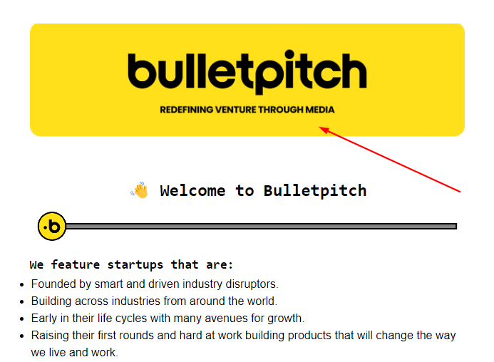
bulletpitch

bulletpitch focuses on Generation-Z startups, covering one paradigm-breaking, high-growth success a week. In addition to the name and logo, the header includes the brand’s tagline: “discover startups shaping the next generation.”
An effective slogan can help focus your message from the top. Establish exactly what readers can expect in each issue.
The Blueprint

The Blueprint, which focuses on residential real estate, combines a bold logo with the creators’ names: James Harris and David Parnes. The newsletter presents insiders’ insights into the industry. Immediately putting names to those insiders reinforces the message.
Ask yourself about the style of your own authority or unique perspective. Does it rely on personal familiarity, a highly professional brand, or a particular mission? Use your banner to remind readers why they’re there.
Milk Road
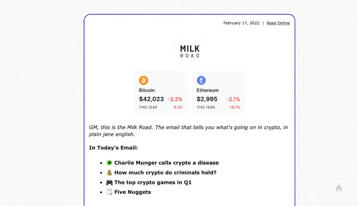
The success of the Milk Road newsletter, with over 250,000 subscribers, is compelling evidence of the effectiveness of beehiiv.
The image above was Milk Road’s first template.
The tagline "The email that tells you what's going on in crypto, in plain Jane English" is clear, specific, and reflects the brand's voice, which is straightforward and accessible.
The header is compact and well-structured, translating well on mobile devices. The information is presented in a way that doesn't require excessive scrolling, adhering to the recommended header height.
Later, Milk Road switched their template to this:

This second design showcases a character illustration, which adds a whimsical, engaging element to the header.
This change demonstrates Milk Road’s dynamic approach to design.
The color palette is also vibrant and eye-catching, with the blue and yellow providing a refreshing contrast likely to draw the reader's attention.
Although this second header is more graphically intensive, the design is optimized for quick loading. The use of bold, flat colors and simple shapes indicates web-optimized graphics.
Camber
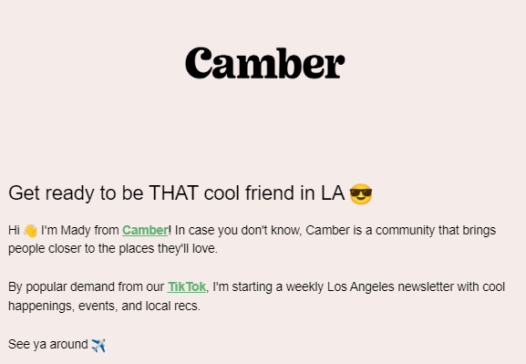
The header prominently displays the "Camber" brand name with a distinct typographic style. This is effective for brand recall and recognition.
When you use unique typography, you make the newsletter instantly recognizable to subscribers.
Camber has also used white space wisely. This enhances the overall readability and visual impact of the header.
Also, informal language and emojis in the header text suggest a friendly and approachable brand personality. This type of engagement is key to building a connection with the audience.
Frequently Asked Questions
What Are the Essential Elements of a Newsletter Header, and How Can They Be Customized to Reflect My Brand’s Identity?
Essential elements include your brand's logo or name, a compelling tagline, a navigation menu (if applicable), and any contact information or social media links.
You can then customize it to reflect your brand’s identity using your brand’s color scheme, typography, and visual motifs that resonate with your brand's voice and values.
For instance, use bright colors and fun fonts if your brand is playful. The goal is to create a header that serves as a visual handshake, introducing your brand and setting the tone for the content that follows.
Are There Any Creative and Effective Ideas for Designing Newsletter Headers, and Where Can I Find Templates for Them?
For creative and effective ideas for designing newsletter headers, you can experiment with eye-catching color gradients, incorporate subtle animations, or interactive elements like clickable call-to-action buttons.
Explore platforms like beehiiv and look at the case studies or Pinterest for inspiration and templates. These resources provide a solid foundation for crafting headers that stand out while allowing room for personalization to make your newsletter uniquely yours.
How Important Is the Visual Appeal of a Newsletter Header in Engaging Readers, and What Role Do Images Play?
The visual appeal of a newsletter header is very important in engaging readers. It's often the first thing they notice, setting expectations for the rest of the content.
A well-designed header captures attention, establishes credibility, and makes the newsletter memorable. Images play a crucial role in this. They convey complex messages quickly, evoke emotions, and add to the storytelling element of the newsletter.
Effective use of images reinforces your brand identity, draws focus to key areas, and breaks up text to improve readability.
Yes, newsletter headers can include functional elements like menus, which are useful for newsletters with multiple sections or extensive content. These menus help readers quickly navigate their areas of interest and improve the overall user experience.
When optimizing these elements for mobile devices, ensure the menus are responsive and easily navigable on a touchscreen. Fonts should be legible, and buttons or links should be large enough to tap without zooming in.
Dropdown menus should be simple and unobtrusive, expanding and collapsing with ease. Remember, on mobile devices, screen real estate is limited, so prioritize simplicity and ease of use to enhance the reader's experience on smaller screens.

Unlike in the past, where you needed to tweak HTML code and grapple with complex design software to create an engaging email newsletter header, beehiiv has simplified the process.
Designing an effective email newsletter header doesn't have to be difficult. If you already have brand colors or a logo, those are good places to start playing with email header design. Those are the visual markers that readers already associate with your content.
If you're starting completely from scratch, think about the words you would want someone to use in describing your brand. How can you translate them into a design that is:
Readable
Eye-catching
Uniquely you
Our success story with Milk Road is evidence of the power behind beehiiv's capabilities. Like Milk Road, which garnered over 250,000 subscribers, you can also craft captivating headers that resonate with your audience.
Another great example would be Andrew Grillo. He grew his B-Side newsletter to over 10,000 subscribers in only a few months and achieved an impressive 60% open rate.
These success stories aren't outliers—they're what you can expect when you use the right tools. beehiiv's user-friendly interface and robust analytics allow you to optimize every aspect of your newsletter for maximum engagement.
Are you ready to transform your newsletter into a success story? Sign up today for a 30-day free trial and experience firsthand the simplicity and effectiveness of our platform.

This blog was originally published on May 2nd, 2023, and has been updated for accuracy and relevance.
